2. Reviewing a Polling Station List
In this tutorial, we're going to learn how to look over and make sense of a list of polling stations. After getting a feel for what kind of data is contained in the dataset, we're going to use an Excel pivot table to explore the data and, in particular, to determine the number of polling stations and total number of registered voters in each district.
Introduction
One of the fundamental requirements for preparing to observe election day is to have access to a full and accurate list of all of your country's polling stations prior to election day. The list should have all stations at which the Electoral Management Body (EMB) will be conducting the elections. If you are doing sample-based observation such as a Parallel Vote Tabulation (PVT), then you will likely draw your sample from this list.
Sometimes, EMBs release lists of polling stations in formats that create a barrier for analysis. For example, if the polling station list is shared in a format that is not analyzable (machine-readable), such as a PDF document, then the data needs to be converted to a format that can be analyzed (such as a CSV, XLS, or TXT file format). This conversion can be done through manual data entry or through an automated procedure like writing a script or using an online data scraping tool like import.io or ScraperWiki. In fact, this data was originally in several PDF documents (e.g., the PDF for Ashanti region) and we converted it to a machine-readable format for you. Now that we have the list in a format that can be read and manipulated in Excel (or other data analysis program), we're ready to begin our analysis.
Excel and List Analysis
Currently, Excel is the most ubiquitous data analysis software in the world and what we'll be using for this tutorial. It can process a significant amount of data very quickly and will easily manipulate our ~26,000 data points. In this analysis, we'll be using Excel to look over the list of polling units visually and then to analyze their distribution by district and region using the "pivot table" function, which is a feature of Excel that allows data to be easily grouped together based on different fields and summarized in a variety of ways. Pivot tables thus facilitate easy manipulation and review of data.
Reviewing the data in the list of Polling Stations
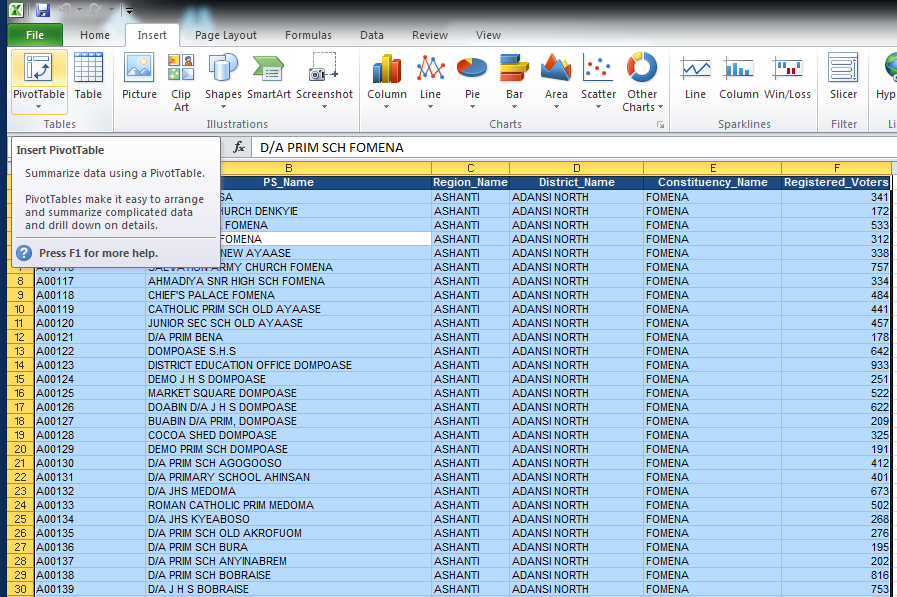
Let's take a look at an example of a polling station list in an analyzable format. We'll start by looking at polling station list based on Ghana's 2008 elections. Download the 2008 Polling Station List in Excel format (XLS). We are going to be using Excel to create a pivot table, but here is the PS 2008 file in Comma Separated Values format (CSV) and OpenDocument format (ODS) in case you are using a different program. Now that the document is saved and open on your screen, let's look over each row and column starting from the top left. The first row contains the name of the data below it.
PS_Code
In the far left column, you'll see PS_Code. Can you guess what that might mean?
What PS_Code stands for in our current dataset is Polling Station Code, or the unique identifier for each polling station. Take a second to manually scroll through the document and notice the pattern of how the polling stations are numbered.
Note that the column title (PS_Code) is listed as one continuous string of letters. Many polling station lists (and electoral datasets in general) are exported or pulled from the EMB's database. One of the fundamentals of databases is that there cannot be any spaces between letters. That's why there is an underscore between the "PS" and "Code." While Excel is able to process data with spaces, it is good practice to label column titles without any spaces.
PS_Name
PS_Name refers, in words, to the name of the polling stations. This is the column that should make most sense to observers, and often it's this column that will be the most helpful for observers to know where to go on election day.
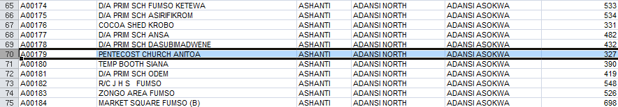
For example, look at row 70, A00179; the observer, who would be recruited from Adansi Asokwa constituency in Adansi North District, would be required to find out where Pentecost Church Anitoa is located, because that's one of the locations where elections will be conducted.
Region_Name
If you scroll down through the dataset you'll see that the column title "Region_Name" has the fewest unique names of all of the geographic groups, making this the largest geographic level that's available in the dataset.
District_Name
Following the region, the district is the second-largest geographic entity in this dataset.
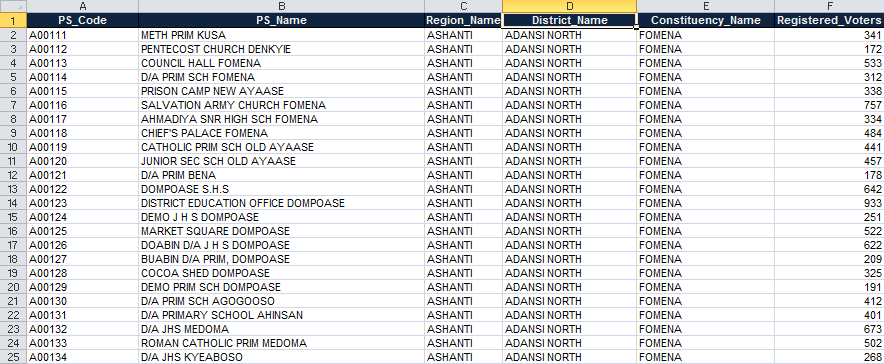
Constituency_Name
In this example, constituencies are even smaller than districts. When we look at this data in a pivot table, we'll see how many constituencies are in this dataset compared to districts and regions.
Registered_Voters
Finally, we have the official number of registered voters assigned to each polling station. In many places, there is a maximum number of voters for each station. In some countries, this cutoff might be no more than 700 voters. In other countries, the maximum number in urban areas might be 1,000 registered voters or more. Limits such as these are designed to make it easier and more manageable to administer the election by ensuring that no polling station gets so large that it would prevent voters from voting due to a long wait. For purposes of the datasets used in this tutorial, the limit is 1,000.
Making a Pivot Table to Help Review the Data (Excel)
Making a pivot table may actually be the easiest part of the exercise. Understanding how to manipulate the data, though, might be more challenging. The following steps are designed for Windows users and have screenshots from Excel 2010; if you have a Mac or an earlier version of Windows, the interface may vary.
1. Select All
We want to select all of the data in this sheet. To do so, click in cell A1 ("PS_Code") and click Control+A (i.e., hold down the "Ctrl" button while also pressing the "A" button on the keyboard). You could also click on the top left square with the little triangle.
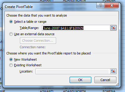
2. Inserting the table
Now that all of your data is selected, click on the "Insert" tab in the top menu and then click "Pivot Table" along the left. A pop-up window will appear that says "Create Pivot Table".
Leave the options as their defaults and just click "OK", and Excel will make a new pivot table in a new worksheet.
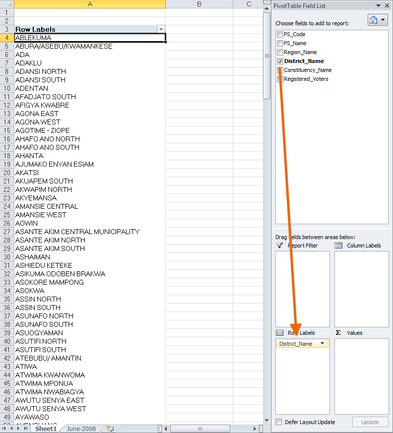
3. Sorting by districts
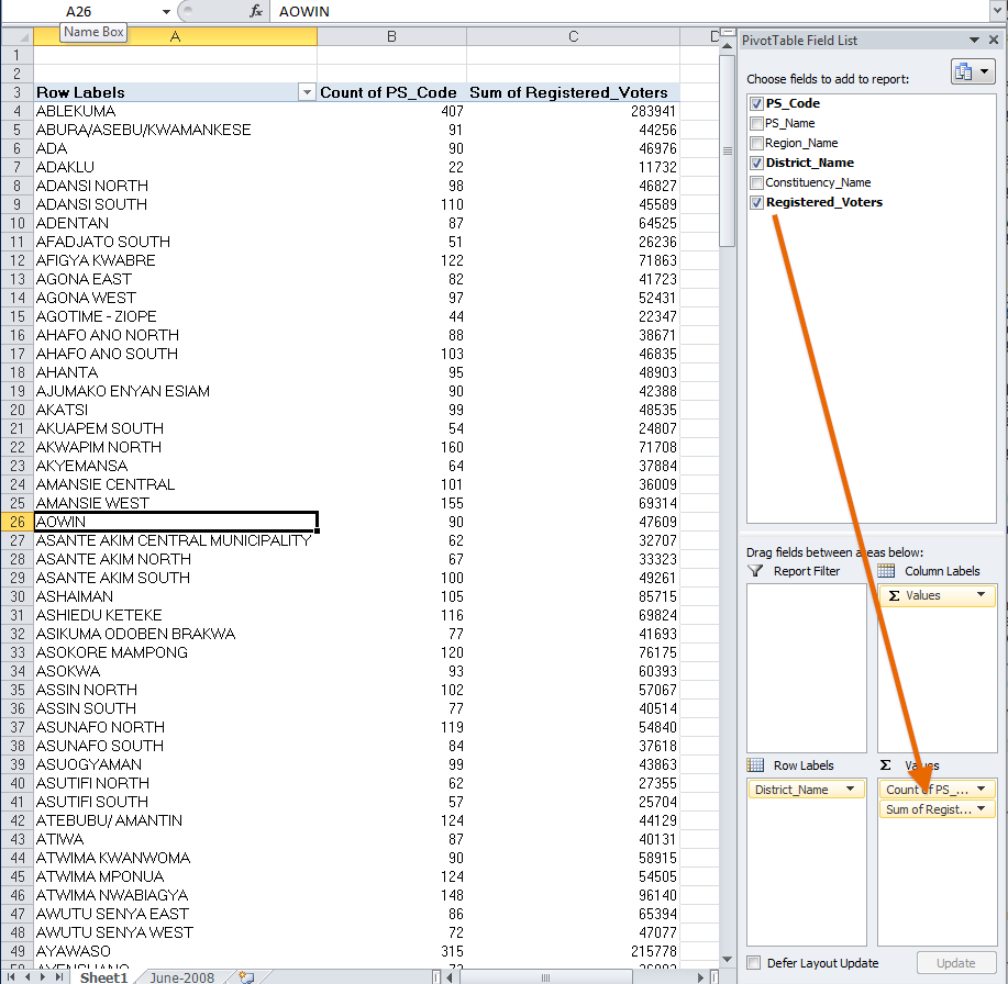
Now that you have a pivot table inserted in a new sheet, we can start working with the data. On the right is a window titled "Pivot Table Field List." Click on "District_Name" and drag/add it to the "Row Labels" area. This will sort everything by whatever value is listed in the "District Name" field. Notice that "District_Name" is now listed in the lower right window called "Row Labels." If done correctly, we'll get all of our districts loaded into Column A. Scroll down and notice that there are 223 rows of district names and a "Grand Total" row at the bottom (no total number is shown yet though). Then scroll back up to the top. This will now allow us to add other criteria based on these fields.
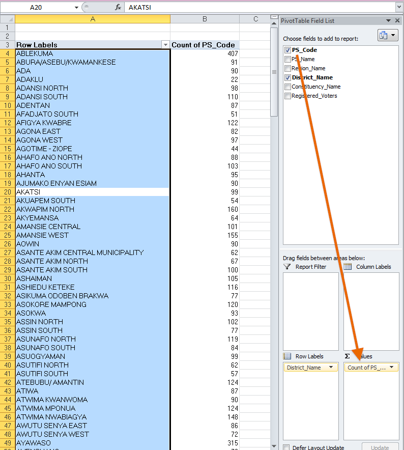
4. Determine polling units
Next, let's see how many polling stations there are in each district. Take "PS_Code" on the right and drag and drop it into the "Values" section on the bottom. If all goes well, the pivot table should default to showing a count all of the cells that have a value for "PS_Code" in for each district. You can check this by hovering your mouse pointer over the values in Column B, and a note should say "Count of PS_Code." Notice that now "Count of PS_Code" is listed in the lower right window under "Values." If you've done it correctly, it should display 407 for Ablekuma, 91 for Abura/Asebu/Kwamankese and so on. See below.
If instead you have only zeros as totals in Column B, then we need to tell Excel to count the number of different codes/rows. Instead, Excel is trying to sum up the values in that column, and, since it is a text field, the sums are all zero. To make sure Excel counts the fields (instead of summing the fields), we need to go to "Sum of PS_Code" in the Values window and click the arrow pointing down. This will give us a window where we need to click "Value field settings," and we will get a new window. Under the "Summarize Value Field By" choose "Count." If you've done it correctly, it should display 407 for Ablekuma, 91 for Abura/Asebu/Kwamankese and so on. See below.
Now you know how to make a pivot table in Excel!
5. Determine registered voters per district
Now, let's get a feel for how many registered voters are in each district. Click and drag "Registered_Voters" onto the Values box as well. What we want is a sum of all the values for the number of registered voters. However, right now, Excel might be showing the "Count of Registered_Voters" (you'll know this because it will list the same numbers in Column C as are listed in Column B for "Count of PS_Code"). To make sure Excel sums the "Registered_Voters" fields (instead of counting the individual rows), we need to go to "Count of Registered_Voters" in the "Values" window in the lower right of the screen, and click the arrow pointing down. This will give us a window where we can click "Value field settings," and we will get a new window. Under "Summarize Value Field By" choose "Sum." Excel will sum up the number of registered voters for each district and display the large numbers that you can see below.
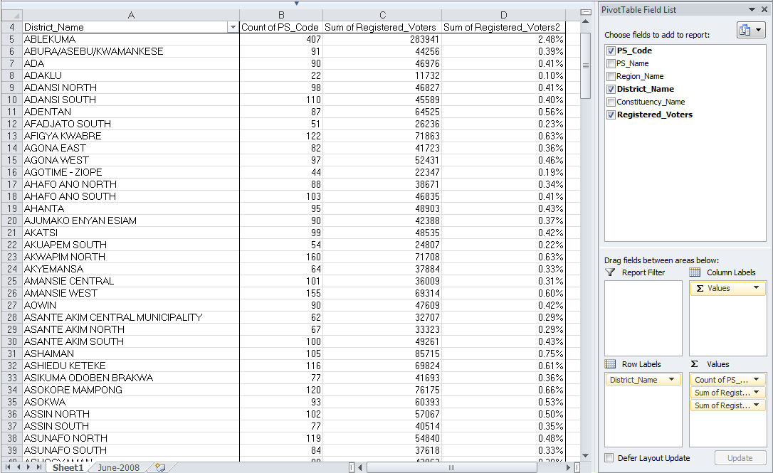
6. Determine proportion of voters registered per district
Finally, let's see what the percentages of registered voters are spread across the districts. This will first involve repeating some of the same steps from Step 5, above. First, add "Registered_Voters" to the Values field again. Go to the "Count of Registered_Voters" line in the Values window in the lower right and click the arrow pointing down. Then click on the "Value field settings" to get the new window. Under the "Summarize Value Field By" choose "Sum" and then click on the "Show values as" tab. On the drop-down list, choose "show values as percentage (%) of column total" and then click "OK." Now you have the number of registered voters in each district expressed as a percentage of the total number of overall registered voters.
Using the Pivot Table to Examine the Data
Using a pivot table is a very easy way to examine a lot of data very quickly. However, if bad data is being used to power the pivot table, we still have problems. As an analyst, it's your job to look over the data to make sure it makes sense and is as accurate, or as "clean," as possible.
For example, look at rows 147 and 148 on your pivot table. You can see that in 147, there's a district called Moagduri and in 148 one called Moagdurii. Is this just a coincidence? Probably not. When you look back at the raw data sheet and scroll down to around row 14127, you can see that the district changes to Moagdurii with two 'i's. If we look further into the data in "Moagduri" and "Moagdurii," we see that the same polling station code continues, both are in the same region and constituency and have very similar counts of registered voters. Thus, we would suspect that the EMB just misspelled the name of the district in its database. At this point, as an analyst, you would want to check with a colleague or any other person who knows the situation in more detail, and double-check the data.
What Do You See?
Take another look at the pivot table and answer the following question:
- Which three districts have the largest numbers of registered voters?
- Which three districts have the lowest numbers of registered voters?
- Bonus Question: Take a look at the original list. Is there anything that seems strange (besides the Moagduri/Moagdurii district names)?